Ecommerce Design Elements That Drive Conversions

According to a study, 92% of consumers visiting a retailer’s website for the first time aren’t there to buy. About 75% of your visitors will judge your brand credibility based on the design of your website.
What’s more, other studies also show that it takes around 90 seconds for your visitors to assess your product and less than 5 seconds before they leave your website after the first glance. There are many factors that may contribute to this statistic. Truth be told, your web design plays a major role when it comes to your visitors buying or leaving.
Here are six examples of how our team at WMD has created bespoke ecommerce design elements and experiences for our clients that drive conversions.
Example 1: Doughees - Interactive Product Bundle Page
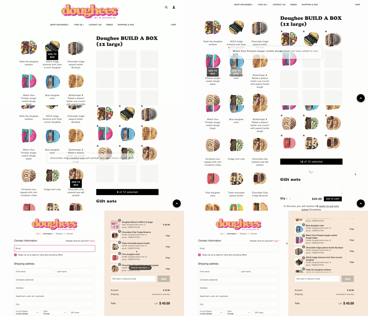
When it comes to conversions online, the product page plays an integral role. This is where your customers make a decision and perform different actions such as selecting a size, color or flavor to "add to cart." A lot of these product pages are limited to mostly purchasing one product. Letting your customers purchase more than one product at a time saves them time and encourages more conversions.
One of our clients that sell cookies on their website wanted to enable their customers to purchase multiple cookies on a single product page. After reviewing the requirements, we decided that having an interactive custom bundle page where their customers can pick and choose their flavors would be the best approach. With that goal in mind, we have customized their product page that displays all the flavors with their names and images on one side and displays the custom order on the other side. Their customers can simply click the image of the cookie they like and it will show up on the "Build-A-Box" so they know what they have chosen and how many more they can add. They have the options to de-select and replace it with another cookie flavor as well.
Furthermore, we have also customized their cart and checkout page to show the complete order with the product images so their customers can double check and make sure everything is correct before placing the order. This provides a complete interactive shopping experience for their customers from selecting the products to placing an order.
Example 2: Damiani - Interactive Services Breakdown
Ecommerce is more than just purchasing a product or service online. It has evolved into anything conversion related whether it's online or offline. Despite the different functionalities, website design keeps your customer's best interest in mind and makes it as easy as possible for them to quickly convert from a visitor to a customer.
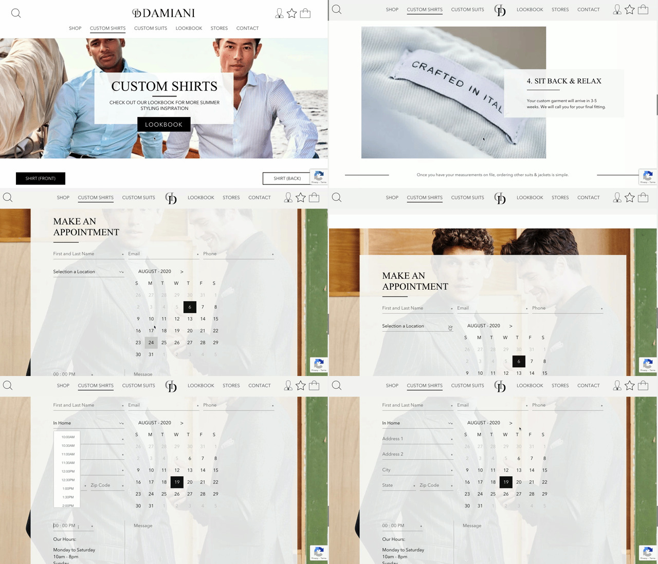
A client of ours that offers custom made shirts and suits for both men and women wanted to offer appointment scheduling for their customers to book online. Since consumers in the fashion industry are expecting more personalization, we designed and developed custom made pages on their ecommerce site with interactive explanations about the different parts, processes and an appointment booking section.
The first section shows all the different customization options for a shirt or suit. The interactive sections visually outline the different parts of a shirt or suit you can customize to ensure a perfect fit.
On the front end, we created a calendar where their customers can choose a date and time based on the availability. On the backend, we set up the business hours, the location options where they want to have the appointments, the time intervals between appointments, holiday exclusions and more.
With the new custom shirt and suit pages, customers can select the different locations where they want the appointment to take place such as the flagship store, their home or office. When the customers select their home or office, additional fields will appear so they can enter their address, zip, and city. Once they submit the appointment, it will take them to a confirmation page and Damiani will receive an email with the appointment information so they can confirm with their customers.
Example 3: The Kingdom - Dynamic Shop Filter
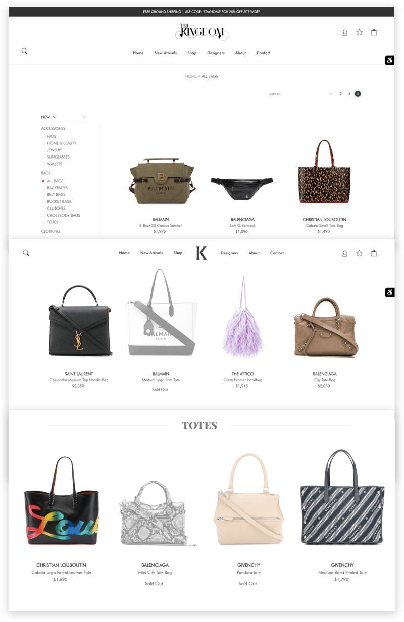
Time is of the essence. Letting visitors find what they want as easy as possible is the secret to any online store. A shop filter, when used correctly, drives more conversions for your site. If you carry more than a few products or categories, having a smart filtered navigation is important to helping your customers narrow their product search.
A smart filtered navigation is great, but we take it up a notch by creating dynamic shop filters for our clients. Once a customer chooses a category, the product re-loads and shows only the chosen category, which allows them to immediately see the other filter options they may want. The color and size variants will populate to show what’s available or not. It improves the user experience (UX) by saving them time to choose something that may no longer be available in a product category, like a specific color or size.
Example 4: Cooper Street Cookies - Customized Reviews
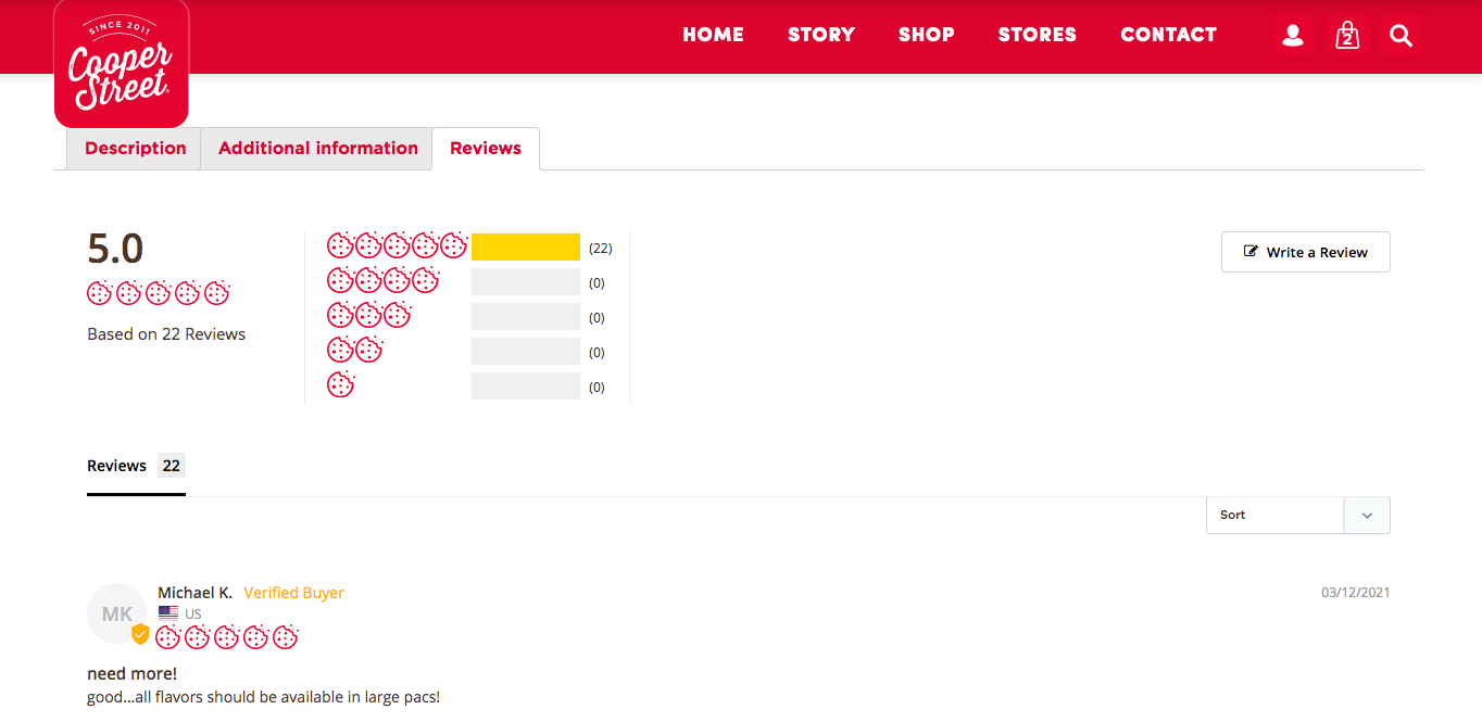
Reviews are everywhere. Studies show that 90% of consumers read online reviews before visiting a business and they need to read 40 online reviews before they believe a merchant's average star rating. And 88% of consumers trust online reviews as much as personal recommendations. There is no doubt that reviews have a major influence on online consumers.
As popular as reviews are on ecommerce sites, we want to make our clients’ brands memorable. Instead of the typical star icons that are used everywhere, we create unique custom icons that illustrate our clients’ products. For a client of ours that sells cookies on their website, we created a custom cookie icon and replaced it with the star icon in their review system. It reflects our clients’ effort to be recognized, grab attention, and stand out. These reviews were also automated so that after two weeks from the purchase an automatic email was sent to the customer to leave a review. This also allows our client to ensure the highest quality products are being shipped and received without issues. And if there is any issue, they would be able to address and get it resolved immediately.
Example 5: Alchemist - Branded Navigation Menu
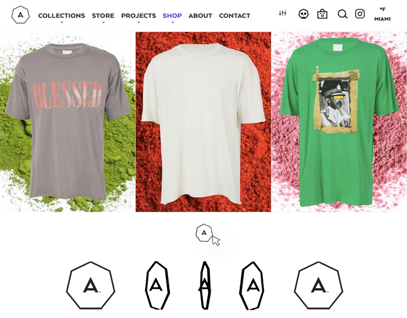
Good iconography goes beyond some simple icons. Besides brand recognition, it serves a very functional purpose in ecommerce design. When used correctly, icons provide users with a visual cue as to how they should behave when interacting with your online store.
For one of our clients, we have created these specially crafted icons for their ecommerce website. Since they are located in Miami, having a live icon that shows the current temperature and the location would be fun since Miami is such a hot tourist spot. With their profile icon, we use the hexagon of the logo and added the avatar of a skull with a winking hover effect. For the shopping bag, we add a cute face that turns into a smile when it is hovered. For the search icon we made the magnifying glass into a hexagon shape to match the logo. Last but not least, we animated a 3-D spinning effect on the logo when the user hovers.
Example 6: ALEPEL – Animated Logo
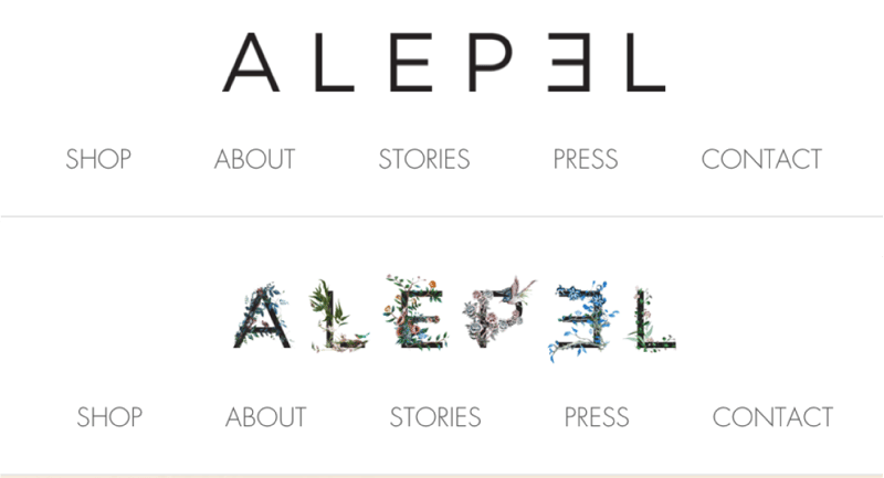
Like your website, your logo is part of your brand identity. For your website to look professional and drive conversions, you should give careful attention to your logo’s components and effect. Your logo and web design must match and work together to ensure the success of your website.
A client of ours owns a store selling handmade shoes in Brazil using high quality materials and techniques, and are hand-painted by local artists in the Miami area. They use a lot of nature and unique patterns in their designs. They have a clean and simple wordmark logo so we added an animated hover effect using a floral pattern to create a blossom effect. We also did a more elaborate version of the logo with the email sign-up popup form where the flower blossom and birds fly out slowly from the animated doors. This kind of design grabs attention and creates unique memories. It is on-brand and gives their customers an impression that our client is attentive to detail, which is a crucial quality for their line of work. It creates credibility and loyalty, so their customers buy with confidence which drive more conversions.
Testing and maintenance is also important for an ecommerce website success. It lets you know what works and what customers might be experiencing. Continuously testing and making improvements on each of these elements to stay ahead is essential to offer a flawless online shopping experience.
Ecommerce website design is the key to making online shopping a rewarding experience for the customers and drives more conversions for you. Implementing conversion-centric design elements that initiate user actions and make sure these elements are on-brand and represent your products is key. There are a lot of components that go into making an online sale. The rule of thumb is to keep your brand and customers top of mind. When you have a well-designed ecommerce website, your visitors can rely on you. It builds trust. When visitors trust you, they are more likely to purchase your products and services.
