How to Optimize Your Ecommerce Checkout Flow
.jpg)
You’ve put a lot of work into your ecommerce website. You’ve optimized your content, made the design responsive, and chosen the best payment acceptance solution. But instead of recovering your investment, you’re noticing that a lot of customers don’t complete their orders. Instead, your ecommerce reporting indicates that most of them are leaving at the checkout stage. What’s going on?
If you have this problem with your ecommerce site, you’re not alone. The Baymard Institute estimates that close to 70% of online purchases from 2012 to 2019 end up being abandoned at the last minute. When you consider the value of those abandoned shopping carts, it all adds up to a pretty substantial amount of lost revenue.
To reduce your checkout abandonment rate, you need to look at your checkout flow first. By optimizing your checkout process, you can ensure that customers don’t give up before they complete their purchase.
What Does a Typical Checkout Flow Look Like?
The best way to improve your checkout process is to make it as simple as possible. An ecommerce checkout process consists of the steps that a customer takes to put items into their shopping cart and pay for them. It might look something like this:

Source: Bolt
Most ecommerce websites follow a checkout flow similar to the one above, with a few exceptions. For example, ebook and SaaS merchants may not ask for a customer’s address, as the products are delivered digitally. Otherwise, all checkout processes start with browsing through products and end with an order preview, payment, and purchase confirmation.
What is Checkout Abandonment?
A customer can abandon their cart at any point during the purchase. Checkout abandonment is a specific type of abandonment that takes place when the customer gets as far as the checkout stage before giving up.
Here are the most common reasons for checkout abandonment:
- Unexpected charges: This is by far the biggest single factor influencing checkout abandonment. When you add on extra fees, such as taxes or unexpected shipping costs, the customer is more likely to have doubts about their purchase.
- Complicated processes: If your checkout process is confusing or excessively complicated, customers are likely to leave the page out of frustration.
- Security concerns: Customers give you their contact details and payment information. The moment they perceive security issues with your site, they’ll abandon their purchase.
- Payment methods: Customers want to use a payment method that’s convenient to them. Therefore, you should aim to accept as many different payment methods as possible.
- Performance issues: Slow page loading times and site crashes will put your customers off and cause them to become frustrated and give up on their purchase.
- Forced account creation: If your site requires the customer to create an account before they can check out, many customers simply won’t do so and will go and shop elsewhere instead. This is particularly true for one-off purchases.
If your checkout abandonment rate is 69% or higher, you need to take a long and detailed look at your checkout flow. Chances are, one or more of the above issues is at fault. Once you’ve identified the problem, you can come up with strategies to reduce the abandonment rate. As a rule of thumb, you should aim for a rate somewhere between 40% to 60%.
Differences Between Checkout Abandonment and Cart Abandonment
Many people tend to lump checkout abandonment in with cart abandonment. However, because they happen at different stages of the sales process, you need to look at them differently.
The main difference between the two lies in when customers leave your ecommerce site. Cart abandonment takes place when the customer adds items to their shopping cart but leaves without checking out. Checkout abandonment happens when the customer initiates the checkout process but leaves the site before completing the purchase. Use your ecommerce reporting system to identify which issue you’re struggling with (it may be both).
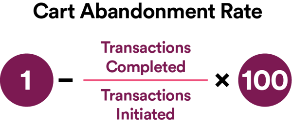
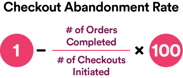
This means cart abandonment and checkout abandonment rates are computed differently.
Cart abandonment follows this formula:
Meanwhile, checkout abandonment uses the formula below:
There are many factors that cause both cart and checkout abandonment. Website performance issues, unexpected charges, the lack of delivery and shipping options, and poor website design are just some of the most common. However, to reduce checkout abandonment, you need to optimize the checkout process itself. We will discuss checkout optimization methods in the next section.
7 Ways to Optimize Your Checkout Flow
If your ecommerce reporting has identified that checkout abandonment is a problem for your site, you might be wondering what to do about it. First: don’t panic! Next, keep reading. We’ve put together 7 proven ways to reduce checkout abandonment that you can implement on your site.
Let’s get going!
1. Remove additional charges at the time of checkout
This is the single largest reason for checkout abandonment, so this is the first thing you should focus on. Once a customer sees the cost of a product displayed on your page, they will assume that’s what they will actually pay. When they get to the checkout page and see additional charges, they will feel misled and annoyed.
Instead of displaying the additional costs only at the point of checkout, try displaying them earlier in the process. For example, you could add shipping and handling to the price when the customer adds the item to their cart. Taxes are more complex, as not all jurisdictions require taxes to be added at the point of sale. Ensure you follow any relevant legislation in your area.
2. Optimize your site loading speed
Customers are impatient. HostingManual estimates that over 50% of users will leave a page if it takes longer than 3 seconds to load, and 80% of those who leave a site, for this reason, will never come back. Retail giant Amazon says it loses 1% of its revenue for each 100-millisecond delay in page loading speed. Google also uses site speed as a factor for determining search result rankings.
In other words: page speed matters. Here are some strategies you can use to boost your site’s load speeds:
- Combine webpage files. Your page is composed of many different files, and the more files your browser has to open, the longer it will take to load the page. Combining CSS and JavaScript files into just one file for each type will help your page load 80% faster as the number of HTTP requests also goes down.
- Run a compression audit. The smaller the files on your site are, the faster they’ll load. Whenever a page goes over 100 KB in size, its load time will increase. Doing a compression audit using a tool like GIDNetwork will tell you how large your checkout page is.
- Compress your website files. Compressing entire websites with GZip is considered standard practice. If you run your ecommerce site using WordPress, you can use a plugin like WPRocket to enable GZip compression and reduce page loading time by up to 70%.
- Reduce image sizes. Large image files take more time to load. For example, if you want an image to appear 500 pixels wide, don’t upload a 2000-pixel image and let the width parameter do its work. Crop or resize your image so that it fits your size requirements instead. You can reduce image sizes automatically using a plugin like WPSmush.
Reducing your page loading time will give your customers a better shopping experience, keeping them happy and ensuring they don’t abandon their cart before checking out.
3. Don’t force your customers to register
Forcing your customers to register for an account on your site might reduce the chances that they’ll return and buy from you again. That’s if they check out at all. Forcing customers to register is a major cause of checkout abandonment. Instead, just ask for their email address and any essential information you need to administer their order.
Pro tip: get their email address as early in the process as possible. You might need to use it later.
4. Keep the purchase process clear
A major part of creating a great customer experience lies in setting clear expectations. Therefore, keep things as clear and simple as possible.
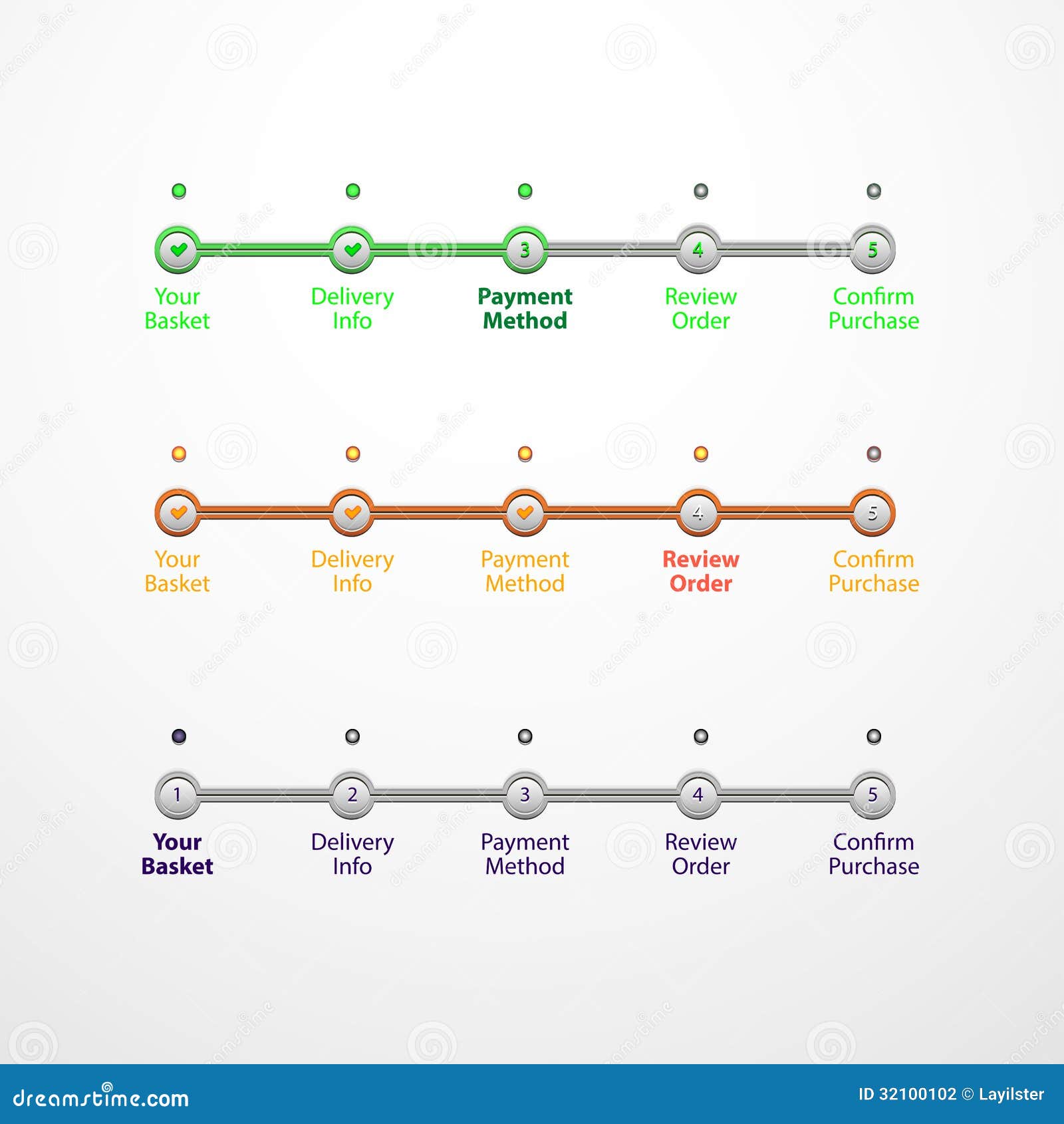
Source: Dreamstime
One strategy I like is to use a progress bar or similar tool, such as those pictured above, to remind your customer where they are in the process. Add simple captions such as “Checkout” and “Payment”. If they see that they’re nearly finished, they will be more likely to push through and complete the purchase.
5. Add trust badges to your site
Many customers abandon their purchases at checkout because they don’t feel confident that their data will be used properly or that their payments will be processed safely. Adding trust badges to your site will reassure your customers that you run your ecommerce site the right way and follow best practices in handling personal and financial data.
Here are some recognized trust badges you could apply for:
- PayPal: This is an indication that you use PayPal’s secure payment mechanism, which protects against merchant fraud, encrypts data, and holds disputed payments until a resolution is reached.
- Visa: This is the most recognized payment processing brand. The Verified by Visa merchant program doesn’t charge store owners anything for the badge.
- Better Business Bureau: More than 170 million people check out the BBB website each year to discover brand and product ratings. Getting yourself a BBB accreditation shows that you do business ethically.
- Google Customer Reviews: When you sign up for Google Customer Reviews, your customers can give their opinions about your products or services. Once Google decides that your reviews meet certain standards, it issues the Google Customer Reviews badge, which is widely recognized among customers.
While you don’t have to display your trust badges on every page, displaying them prominently on your checkout page will convince customers that your store is legitimate. And that will reduce checkout abandonment rates.
6. Send checkout abandonment emails
Remember when I said you should ask for your customer’s email address at the start of the sales process? That’s so you can reach out if they abandon their cart at the checkout.
Abandoned checkout emails help you recover lost business by convincing customers to return and complete their purchase. You can also use them to gather customer feedback about your site and checkout process. This feedback can be valuable as you design a checkout process that results in higher conversions and lower abandonment rates.
Here’s an example of a creative checkout abandonment email:

You can even convince the customer to return by offering a discount or a limited-time bonus. Gamified ecommerce forms with an exit-intent feature have the same function.
Your profit margin might take a minor hit, but it’s better than losing that customer’s business altogether. To keep customers from gaming the system to their advantage, set up an email rule that allows this action only once per unique customer (based on their email address).
You should use an email verification service before sending these emails. This ensures the customer’s email address is genuine, preventing bounces and keeping your deliverability score high.
As you write your email, you also need to be mindful about ensuring that it doesn’t trigger your customers’ spam filters. The easiest way to do this is to avoid using certain words in your email subject line. Phrases like “exclusive deal”, “once in a lifetime”, and “100%” can all trigger spam filters.
7. Set up a cart auto-save function
As a customer, the last thing you want to see when you click on a checkout abandonment email to complete your purchase is an empty shopping cart. Looking through an ecommerce website’s product catalog and adding items to the cart takes time. Your customer won’t want to go through it all again just to complete their purchase.
Instead, you can use your customers’ email addresses to set up an auto-save function. This makes it as easy as possible for people to come back and complete their purchase quickly.
Optimizing your checkout flow to reduce cart abandonment
The checkout flow is one of the most overlooked processes in ecommerce. A poorly-designed and executed checkout process will lose your customers. And lost customers means less revenue for your business. If you suspect you’re suffering from a checkout abandonment problem, use your ecommerce reporting system to identify your abandonment rates and work to improve them.
There is no single checkout flow optimization method that works for every kind of ecommerce website. Your approach should be influenced by customer feedback and inspired by what the most successful sites in your niche do. The most important thing is to stick with it. Keep testing and tweaking your optimization strategies until you find a system that works!
