How Your Ecommerce Site Search Impacts CX, UX and Fraud Prevention

The humble search bar.
It’s hard to believe that that one field on your website could make such an impact, but your ecommerce site search (and filter) holds a lot of power.
First and foremost, search and filtration help your customers navigate your site. The more robust the search capabilities, the faster your customers find what they’re looking for, and the less likely they abandon your site without making a purchase.
But that filter is also a window into customer behavior – and fraudster behavior. How you use and format the results from your search filter can help you better serve your customers and fight fraud.
Search Functionality by the Numbers
If you’re not convinced about the power of your search functionality and its relationship to your bottom line, consider this:
 About one-third of all ecommerce visitors will use your search function.
 Those visitors are six times more likely to make a purchase.
 Customers who are searching to make a purchase will account for 30%-60% of your revenue.
That’s significant. To understand how your customers use your search functionality, let’s look at the two types of legitimate visitors to your ecommerce website.
Do Ecommerce Customers Know What They Are Searching For?
Customers typically fall into two categories when they visit your ecommerce website:
- Website searchers are customers typically trying to find something in particular to buy.
- Website browsers are customers exploring what is available to buy.
This makes your search function critical. In fact, 80% of customers say they leave one website and go straight to a competitor’s site if the website is hard to navigate or the search utility isn’t useful.

You need to optimize your search functionality to make sure each of these two types of customers can use your search function. Why? Because the features they need for a successful and satisfying experience differs.
Help Searchers Narrow Their Focus
As we said earlier, searchers are more likely to make a purchase on your site. They need a variety of filters and the option to search by product name or even SKU number to help them play detective. They may be looking for a particular type of item or even a specific product. But they have money to spend and a strong intention of spending it on your site.
With high-intent customers, the sale is made, as long as your search engine makes it easy for them to find what they’re looking for.

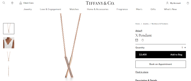
Take a jewelry site as an example – since jewelry has become a hot ecommerce market. A searcher on a jewelry website may be looking for a necklace like the one she saw on a model in Vogue or another fashion magazine. She read the fine print describing what the model was wearing and went straight to the web to find and purchase it.

Source: https://www.tiffany.com/jewelry/shop/new-jewelry
She will likely search by the name of the necklace. If there was no identification on the image, she will filter by necklace, type of metal, finish, gems or no gems, etc.
This seems straightforward, but not all ecommerce teams do what’s needed to make their search results smart and precise. For example, the search engine might not make alternative suggestions if the searcher misspells the item, leading to a frustrating “No results found,” and a customer who’s already bounced away to greener pastures.
To create a powerful search function on your website, you’ll need to follow some of the industry best practices pertaining to natural language processing (NLP), Artificial Intelligence (AI) assistants and analytics. The more functionality you build into your searches, the more likely you can capitalize on their value.
Give Browsers Suggestions
Browsers are those customers visiting your site with the intent of “just looking” or trying to decide between products or brands. Browsers tend to be much more likely to take advantage of product suggestions from your recommendation engine, or to navigate to pages like, “New Arrivals,” instead of “Shorts and Capris.”
This is where your search and filtration functionality can really make a difference. Because Browsers aren’t quite sure what they want, they’re a lot less likely to use the search bar as soon as they hit your homepage. But once they start browsing the site and narrowing down what they want, they are likely to use search and filtration to create their short list of options.
Incorporate Soft Categories
In addition to offering “hard categories” of products, you can also create secondary suggestions or “soft categories” to drive sales.
The difference?
Hard categories are predetermined based on what the product actually IS and can be filtered to various levels of granularity – Earrings, Hoop Earrings, Gold Earrings, Gold Jewelry, Fine Jewelry, etc.
Soft categories employ "Buy Now" reasoning that is very popular in-store but for some reason is forgotten about online by many retailers.
These typically touch on the basic instincts, such as:
- Time scarcity: “Limited Time Offer!” or “Just In!”
- Product scarcity: “Only a few left!” or "Final Offering!"
- Going with the crowd: “Trending Products”, “What's Hot”, “Summer Style”, etc.
- Flex categories (or Hard-soft categories): "Products under $500" or "Frequently Bought Together"
If we use the same jewelry site again as an example, a browser visits a website to see what he could purchase for his mother’s birthday. He’s not sure what to get her, so he clicks on “Gifts for Her” to get some ideas. He uses the filter to narrow things down to bracelets and necklaces. While looking, he sees a necklace with a blue sapphire pendant, remembers his mom loves sapphires, and types that into the search engine to see what else is available. He then filters those results and eventually, his circuitous route takes him to the shopping cart.
If our browser didn’t have those soft categories to look at, he may have struggled to find the direction that led to his final decision.

"Decision fatigue, the exhaustion a user can experience from being forced to make many choices in a short period of time, is a very real experience for shoppers, and can be avoided by using easy to understand visuals in conjunction to text to show choices. Next time you are displaying a set of options, try using icons or thumbnail images that pair with your choices to help them make their selection easier and avoid that decision fatigue."
– Michael Burpoe, Director of User Experience at Punchmark
What’s the takeaway here?
Browsers need robust, practical filtration options
When you’re setting up filters, keep in mind that they should be structured based on your customer personas and how they shop.
Here are a few quick tips to consider:
- Display which filters your customers have chosen – it allows them to see if they mistakenly added or forgot one.
- Make removing filters as easy as adding them.
- Know your customers and limit the number of filters to what’s important to them. When in doubt, however, err on the side of more. Drop-down filter menus make it easy for customers to skip the filters that don’t interest them.
- Let customers choose more than one option in a filter category.
- If you are out of stock for a product, don’t let customers select that filter option.
- Make sure your filters work across channels, including mobile.
Add Content to the Mix
For both types of customers, you can make an even bigger impact by adding content to search results. More and more, companies are incorporating their blogs, communities and social posts into search results through strategic tagging.
The result?
Customers not only find product listings, they also get pertinent blog posts about the products, social posts with those products being worn or used, and community pages with even more information to help create brand affinity and increase sales.
Better Search = Personalization = Better UX and CX
There’s no doubt that personalization is a nonnegotiable in today’s ecommerce websites. Brands have to do more than demonstrate the value of a product – they have to match their products to their customers’ personas and preferences.
Your search and filtration engines can help with this. When search results and filtration preferences are combined with tools like heatmapping, it gives a very clear picture of who the shopper is and what they typically like.
That information can be used to deliver search results, suggested items, and helpful content that favor customer preferences. The result? A much more personalized and delightful customer experience, and increased odds of a sale.
How Fraudsters Use Search and Filters
The unfortunate reality for any ecommerce store is that you are always on the lookout for fraudsters, but you don’t want to turn away good customers.
Fortunately, that the same data you gather to delight customers can be used to fight fraudsters.

By tracking how your visitors use your search functionality, you can give your fraud analysists and fraud protection solution partner valuable insight into customer patterns – and which customers stand out as fraudsters.
A fraudster uses filters in a different way than a legitimate customer will, mostly because fraudsters want to get on and off your site quickly. Here are some signs that you may be dealing with a fraudster:
Fraudsters Look for the Most Expensive Items
Unlike valid customers, who often look for discounted or reduced pricing, fraudsters are looking for high value items that will resell well. Pay attention to visitors who consistently sort by highest price, especially when it’s the first selection they make.
Fraudsters Don’t Comparison Shop
Keep in mind that some customers are very clear about what they want and don’t need to compare one product with another, but a visitor who never comparison shops is suspicious.
You don’t want to automatically deny their transaction and risk a false decline — that would be worse in the long term than any resulting chargeback if the customer is valid. (Read our 2021 Global Ecommerce Consumer Behavior Analysis to find out why.) But, you may want to flag that visitor’s transactions for manual review.
Overall, make sure you track search and filtration activity to help your fraud prevention team keep your valid customers safe and your business successful.
Be Intentional with Your Ecommerce Site Search Filter
Ecommerce merchants need to invest thought, time, and effort into the functionality of their ecommerce site search and filter capabilities.
In today’s market, where CX is paramount, your search and filtration options allow you to create a personalized and delightful experience for customers. They also give you the vital data that can help your fraud team easily spot potentially fraudulent transactions.
At ClearSale, we work with clients up to and including enterprise-level merchants to help them fight fraud, improve approval rates, and decrease false declines without compromising the customer experience. To find out how you can apply our recommended ecommerce best practices to your site, feel free to reach out.


