Top 5 e-Commerce Product Page Design Hacks

You’re getting plenty of shoppers to visit your e-commerce store, but you are noticing that they aren’t adding items to their cart and completing their transactions. You don’t know why it’s happening — and even worse, you’re not sure how to fix it.
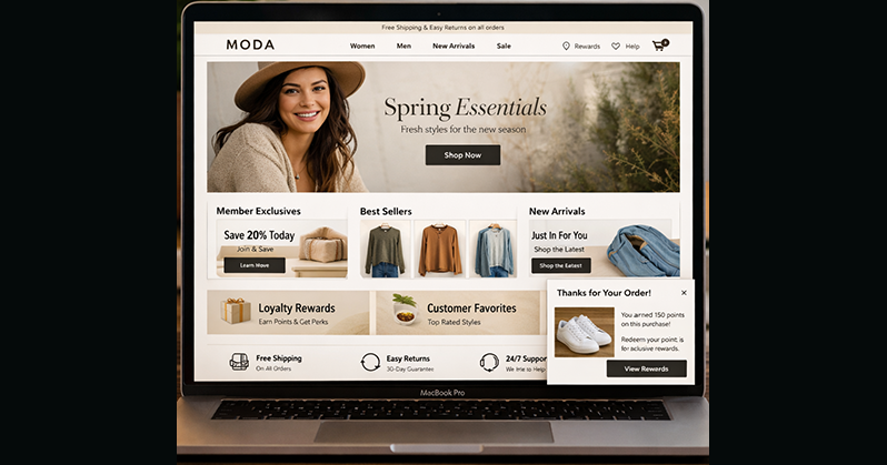
Luckily, some quick and easy tweaks to your product page design might be all you need to turn your product pages into high-converters. Read on to see our top five product page design recommendations for improving your conversion rate.
While it’s true that most product pages tend to follow similar formats, merchants should never be afraid to switch up the design and try something new if they notice conversion rates decreasing. With just a few simple and inexpensive changes to their page design, merchants may find they can quickly increase sales and improve customer relationships.
Here are five of the best pieces of advice we’ve found for turning poor-performing product page designs into high-performing ones.
1. Have a Clear Call to Action (CTA)
The end goal of the product page is simple: Have the customer purchase the product. So if you’re thinking about redesigning your product page, fine-tuning your CTA is a great place to start.
Make sure your “Buy Now” or “Add to Cart” stands out from the surrounding content and is immediately viewable when a customer lands on the product page. If customers have to work too hard to find the Buy button — if it blends in on a cluttered page or the customer has to scroll to get to it — you risk losing them to a site that’s easier to navigate.
And don’t try to be clever with your wording. Using a CTA like “Gotta have it” might confuse the customer, whereas “Buy” is clear and to the point.
2. Include Better Product Photos
Understandably, customers want as many details as they can get about a product before they buy. One of these important details is product photos. But they don’t want just a simple stock photo. More than 58% of customers want to see photos that give a 360-degree view of the product. So while merchants should certainly put a large product image front and center on the design page, they’ll also want to include a photo gallery consisting of a variety of high-resolution photos from multiple angles and featuring all product variants (size, color, etc.).
There’s another image type that can attract buyers and increase e-commerce sales: user-generated photos. Showing how real-life customers are using a product not only increases a customer’s confidence in knowing this is the right product for them, but it also shows that the merchant can be trusted to deliver the product. As a result, retailers using customer photos on product pages showed that an increased percentage of customers who transitioned from the product page to the checkout page.
3. Add Plenty of Product Details
Even with amazing photography, don’t assume that customers can glean product details from pictures alone. Be sure to include ample details about the size, shape, materials, and flaws (if any) of the product. If the product has an interesting story behind it — like from where it’s sourced or what inspired its creation — consider including that.
When creating the optimal product description, ensure you understand your current and prospective customers. Are they already experts about the products you sell (e.g., professional-level photography equipment), or do you cater to a range of expertise or knowledge levels (e.g., everything from beginner to professional photography supplies)? Write your descriptions accordingly, and balance giving sufficient information to new customers without talking down to the experts.
4. Include Customer Reviews
Crystal-clear photos and comprehensive product descriptions may not be enough to convince customers that your product is the right one for them. Before they make their final purchase decision, customers are increasingly turning to product reviews to do research, compare prices and identify vendors.
Consider adding customer reviews and testimonials to product page designs to help entice customers to complete their purchase. Not only do reviews give customers a better understanding about how products function in the real world, but they can also bolster your reputation as a trusted, honest seller.
5. Display Shipping Information
Shipping costs have a significant influence on purchasing decisions and cart abandonment. For customers, nothing is more frustrating than finding the product of their dreams, adding it to their cart, and navigating to checkout, only to find an astronomical shipping cost added at the last minute.
Unconditional free shipping is often rated the No. 1 factor influencing a customer’s decision to make a purchase — so don’t hide your shipping costs. Even if you only offer free shipping above certain purchase thresholds, add it as a banner to pages: 93% of shoppers surveyed said they’d purchase more to get free shipping.
Add a Robust Fraud Prevention Tool
While the addition of a fraud prevention solution probably won’t be something your customers notice while shopping, ensuring your business is protected against fraud is another way you can build revenue and develop long-term customers.
ClearSale’s managed services solution results in some of the industry’s highest approval rates, virtually eliminates false declines and protects against devastating chargebacks. Learn why so many merchants are taking this approach to fraud protection by downloading our free ebook, “Is a Managed Services Solution Right for Your Business?” In it, we explain the differences between a managed services and a traditional outsourced solution and how to choose the best vendor for your needs.

