5 Ecommerce Web Design Tips to Sell More Online

The design of your online store plays a critical role in how much you’re going to sell. Regardless of the products you’ve stocked on your virtual storefront, customers won’t be willing to buy from you if your site is confusing, frustrating to use, and not optimized for them overall. If customers feel comfortable and genuinely enjoy browsing your website, it’ll be a lot easier to convert them. These next five tips are going to be the key to optimizing your ecommerce website’s design for more conversions.
1. Create Clear Calls to Action
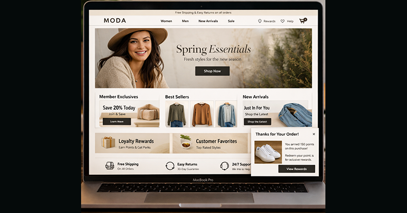
If you want to efficiently convert customers once they’re on your site and interested in your products, your calls to action, or CTA’s, need to be clear and in optimized locations. If your CTA is complicated in any way, or doesn’t stand out from the rest of your site’s design, then customers will be quick to ignore them completely. The highest converting CTA’s use bright, saturated colors that contrast well with your site’s theme, but doesn’t clash with it. It’s also important to keep the text on the CTA button visible and easy to read, with action words and phrases like “Shop New Arrivals,” “Add to Basket” and “Checkout.”
2. Utilize Upsells and Cross-sells
Upsells and cross-sells are both forms of increasing your customer’s orders, but they differ slightly:
- Upsells convince customers to buy a premium version of the product they want.3
- Cross-sells are convincing customers to add on additional complimentary products to their desired product.
You can implement both of these strategies throughout the design of your eCommerce website by adding visual cues and product categories in strategic places. For example, you can upsell a product by adding a banner on the product page that advertises its more expensive variant. Alternatively, a great way to cross-sell supplemental products is by adding a “Customers Also Liked” or “Related Products” section underneath a product description, showing customers that there’s other items on your site that go well with what they’re buying. By exposing customers to a smartphone model with twice the space as the one they’re looking at, or showing them socks that will go perfect with the shoes they want, you can guarantee increased sales.
3. Implement Modal Windows
Modal windows aren’t the same thing as what “pop-ups” used to be; rather than opening in a new window entirely, modal windows are overlaid on the web page that a visitor is currently on. Modal windows go hand-in-hand with CTA’s, because they’re meant to get a potential customer’s attention and call them to action in specific circumstances. One of the most popular modal windows that keeps visitors on your site and boosts conversions is the exit-intent modal, which comes up when a user’s mouse navigates away from your site. These modal windows will typically incentivize users to stay on the site with something they might be interested in, like an email newsletter or an eBook. By encouraging users to sign up in these modals, you’re not only boosting conversions, but your also obtaining leads.
4. Use Trust Signals
Designing your eCommerce website in a way that makes customers comfortable making a purchase with you is vital if you want to increase sales. One of the main reasons customers can get uncomfortable with an online store is if they can’t establish trust right away. Shopping online comes with a whole host of risks so, by alleviating customer’s wariness, they’ll be more willing to buy your products. Some of the most effective trust signals that you can implement into your store’s design are as follows.
Reviews
Displaying reviews on your site, especially your product pages, will give potential customers the social proof that they need to confirm that you are indeed a legitimate store. Reviews can also be helpful for customers to choose the right product for them, or even be the deciding factor on whether they purchase a product. Nothing works better than a glowing review from a happy customer to convince a potential one to convert, so make sure that reviews are easy to find with your site’s designs.
Social Media
By adding social media buttons or links to your various profiles online, customers will become more comfortable shopping from your store and brand. If potential customers can easily see that your company exists on more than just your site, and that you’re active in online communities with real people (namely customers), their confidence in your brand gets high enough to where they won’t have reservations about your store’s legitimacy. Essentially, you’ll be providing visitors with the tools they need to perform an informal background check on your brand.
Trust Logos
Like the name suggests, trust logos are images that you can add to your site that imbues trust among those who visit it. Trust logos can be a McAfee logo that reinforces the security of your site, a banner that advertises your 100% money-back guarantee, credit card logos that inform customers which forms of payment you accept, or even shipping provider logos that help inform a customer’s decision on how they want their order shipped. These logos are typically placed at the bottom of your homepage, in the same area that your store’s contact information and support pages might be.
5. Include Product Photos & Descriptions
Because customers aren’t able to physically see or interact with the products you’re selling, it’s important that you give them all of the valuable information available to help them better understand, and buy, your items. One of the best ways to do this is to take a variety of high quality product photos that show every angle of the product; you can even take a video of the product in action for added clarity. Product photos can be used throughout your site to show off to visitors exactly what you’re selling, how it looks when someone is using it, and why your product is the best of its kind. Often, your product photos can inform the overall design of your site and your brand, so think about aesthetic and composition when you get them taken.
But, pictures aren’t the only thing you’ll need to convince visitors to convert. You’re going to need a detailed and compelling product description that tells them everything they need to know about your product, including features, how to use it, what the item comes with, etc. This is also a good opportunity to add your return policy or any guarantees you have, which can be great ways to improve trust in your customers.
Conclusion
With effective web design, your eCommerce website can be optimized to sell more products than you may have thought possible before. The most important thing to remember, throughout all five of these tips, is that customers want things to be fast, easy, and work as seamlessly as possible. If there’s a design element you’re thinking of adding to your site, ask yourself if it serves this greater goal. Just like you would design a physical store to guide customers to the products they’re looking for in the most optimal way possible, you want to design your online store in the same way. Not only will doing this boost your conversions, but it’ll also make your customers happy.


