What makes your ecommerce website better than others? The user-experience (UX) you offer customers, the attractive aesthetic that makes them say “wow,” or the easy navigation that helps visitors find what they’re looking for instantly?
Let’s explore how a few design tips can make you stand out from the crowd.
Even if you have the most amazing products imaginable—they won’t sell themselves! So you should think of your ecommerce website like your business card. This is the place where you showcase your brand identity. It’s highly likely that your visitors will assume that the way your website looks and feels reflects your business.
Knowing this, you see why it’s important to offer your visitors a flawless user experience. They should find what they’re looking for quickly and without too much effort. They should understand what your website is about the second the page loads.
What to Keep in Mind for the Design of Your Ecommerce Website
1. Simple Navigation
Why do people shop online? One reason: for convenience. The major movements in UX design are to make websites that will make life easier for users. Every detail needs to be logical and users should be guided through every step seamlessly.
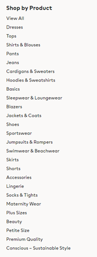
Screenshot from www.hm.com | Product Categories
Your categories
You should structure your categories according to the logic of your clients. If you want, you can test your organization method with a couple of actual users.
There’s tree testing—seeing how easy customers find something only using the text version of your website. You can also use card sorting—you show your users a list of all items and you ask them to group them in a way that makes sense for them.
Tips
- Limit the number of your categories so that you don’t overwhelm your visitors. If you do have a lot of categories, try to place them into main and secondary categories.
- Try and test your categories before you decide on a final version.
- If you have a product that fits into more than one category, place it in all of them.
- Choose the name for your categories for your users, not for your business.
The search
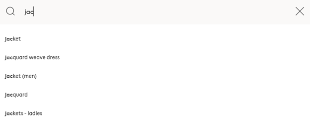
Screenshot from the search bar from www.hm.com | Search Bar Suggestions
Contrary to popular belief, search bars are still used—even more in ecommerce websites. But to make them effective, you need to understand why some users just browse and why some go straight for the search bar.
If your customer knows exactly what they need, they will use the search bar. But if the user is just browsing around your website and hasn’t made a decision yet, they might be looking for inspiration.
Tips
- Place your search bar in a visible, accessible place.
- Dynamically suggest matching results for your users. This way you help your customers find the products they’re looking for faster.
- Make sure that your users still get the right results even if they misspell a word. Try to think of the most common mistakes and take them into account.
- Show similar products or suggest ideas if no exact results come up for your users’ search.
Use filters
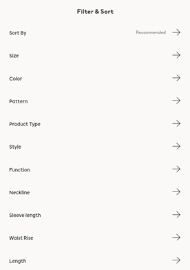
Screenshot from www.hm.com | Filtering and sorting options
Filters are especially useful if you have a lot of products on your website. But to make them useful for your clients, you need to build them strategically. Consider the way people search for products.
When deciding on filters, you’ll need to think of both the order you’ll arrange them in, and also of the input method. For example, if you have filters that need to be precise, you’re better off with text inputs rather than checkboxes or sliders.
Tips
- Arrange your filters in the order of their importance and priority.
- Make sure to choose an appropriate input method. You have a lot of options, from simple text to sliders, checkboxes, or predefined ranges.
- Customize your filters to the types of products you are selling.
Your product list
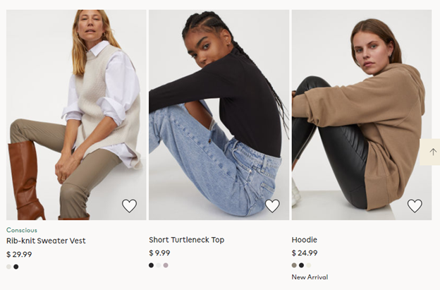 Screenshot from www.hm.com | Product List
If you have a lot of products on your site, it’s easy to overwhelm your customers by offering them too many choices. Having an organized product list can remedy this issue.
To make this efficient, try to display only crucial information next to the product. This can either be size, price, color—whatever your client would ask about first if looking at the product in a physical store.
Tips
- Don’t overwhelm your visitors with too much information.
- Have an option available so that clients can buy things without having to go too much into detail unless they’re interested in knowing more.
- Make it possible for your customers to add products to their wishlist easily.
2. Scannable Product Pages
This is the place where the average user will decide if they’ll buy the product or not. This makes it important to structure your page in such a way that customers find all of the information they need to make a decision—without going overboard.
Imagery
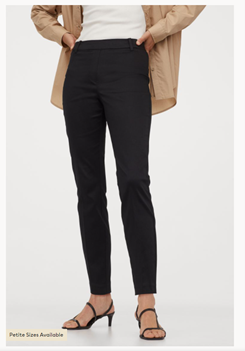 Screenshot from www.hm.com | Quality Product Photo
Always use high-quality photos or a 360° view of your product. One of the biggest problems of ecommerce is that the customers can’t see the products live or touch them.
You can try to solve this problem by using amazing imagery to help your clients get a better feel for what the product is like before they buy it.
Tips
- Try to showcase your products from as many angles as possible.
- Try to add close-up photos and any important details or textures, if possible. This will help your customer understand the product better before buying it.
Product details
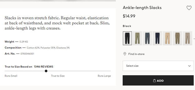 Screenshot from www.hm.com | Product Details
There is a fine balance that needs to be achieved here. Of course, to make an informed decision, your client will need important details about the product—to make up for the fact that the physical product is out of range. But, at the same time, too many details can overwhelm the customer and make it even harder to make a purchase.
The best option here is to initially make only an overview of the product visible. There are some people for which this will be sufficient. Or, if they want more, make sure to have more information available and accessible by pressing a button or scrolling down the page.
Tips
- Try to accommodate all types of users on your product page.
- Keep the page as decluttered as possible.
Call to Action buttons
These buttons are what guide the customers to complete an action—like buying your product. This isn’t the place to experiment and be creative. The users need to understand quickly what you want them to do. Therefore, the recipe for success here is to be short and clear.
 Source: www.bigcommerce.com | Different Types of CTAs
There are different types of call-to-action buttons that you can use, for various purposes. All you need to make sure of is that they’re positioned in appropriate, visible places.
Tips
- Be sure to place your CTA buttons appropriately.
- Make your buttons clear and easy to understand.
3. Distraction-Free Checkout
The checkout process is one of the most important factors in getting your product sold. This means that it needs to be as seamless, simple, and as clear as possible.
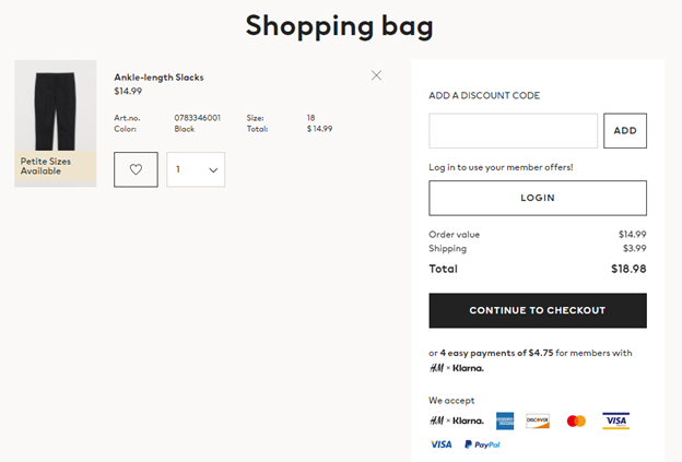 Screenshot from www.hm.com | Checkout Screen
Displayed information
While it would be tempting to suggest similar products for your customer, try to refrain from it. This will only clutter your page and potentially annoy the user.
The same goes for crowding your page with too much information. The client has already picked the products; they’re in the basket; what more could they need?
a. Break the process into smaller steps
Making the checkout process as simple as possible can only be an advantage. If a customer has to deal with too many things at once, they might become overwhelmed.
So, the best solution here is to break your checkout into smaller steps. These could be filling out the billing details, then payment, and then an overview of the order. And, of course, after everything is done, a confirmation that the order is on its way.
b. Show order summary
This one is especially important if we’re talking about large orders. The higher the checkout value the customer has to pay, the more likely they are to feel anxious about messing up their order. So it’s a good idea to let them have their editable order summary available to them at all times.
4. Keep Your Design Simple
Simplicity should be the keyword when someone describes your website. Every element you use should have a function and not be just a decorative feature. As you know, the focus of your design should be your products, not the website itself.
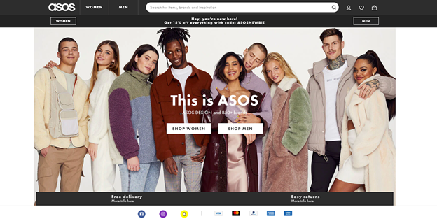 Screenshot from www.asos.com | E-commerce Store Homepage
a. Minimalism
The whole point of minimalism is to eliminate all that is unnecessary. Translated to web design, especially for e-commerce, this means fewer buttons to push and less scrolling to do for your clients.
Having a minimalist design will point towards your products while offering a better user experience overall. A neat, uncluttered design goes easy on the eyes and offers a great first impression.
b. White Space
Using white space to your advantage is a really smart move. You can use it to declutter your page and create a feeling of space. Additionally, it’s a great way of underlining visual hierarchy.
c. Personality
Even if you have a flat design, that doesn’t mean it shouldn’t reflect the personality of your brand. Your website can still look good and be attractive. Just try not to go overboard—maintain a consistent theme and don’t use more than 3 colors in your palette.
Keep in mind that most people that come to your website don’t know what they’re looking for. This is where your design will become functional—you can use elements to guide your visitors through your products.
5. Mobile Friendly
This is something that should be mandatory for any kind of website. You always need to take into consideration that your website needs to be responsive and look amazing on any type of screen. Luckily, if you choose to go with something like a WordPress website design, this is already taken care of.
Always keep in mind that more and more people do their shopping from their phones. Thus, if they can’t find their way around your store on their mobile devices, they’ll move on to the next website.
6. Keep in Touch
It’s always a good idea to get to know your customers and invite them to have a conversation. The best thing you can do is provide multiple ways in which clients can contact you. It can be e-mail, phone numbers, physical addresses, or forms. The important thing will be to keep the methods straightforward and always accessible.
a. The footer
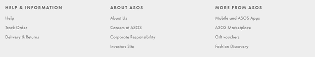 Screenshot from www.asos.com | Footer with Useful Links
This is the last thing your visitors see after browsing your website, so use this space wisely. You can display your contact information here. Or, you can place a group of useful links that can be shortcuts for other parts of your website. It’s also a good idea to place your social links here.
b. The FAQ page
This is a simple way to provide your customers with the answers to the most common questions—without having them need to wait for your response. Usually, for e-commerce websites, the answers people are looking for are about delivery methods, returns, or methods of payment.
c. Customer reviews
People will trust customers that have done business with you more than any cleverly designed advertisement. So it’s always a good idea to showcase customer reviews on your website—as long as they’re honest and they reflect how people feel about your products.
You could have a dedicated page for reviews or you can also give people the chance to leave reviews on the product page. In this way, people can see opinions that specifically refer to products they’re interested in purchasing.
d. More about you
Let the people get to know you! What is the message of your company? Who are your employees? Displaying this kind of information on your page can only be beneficial. It’s easier to do business with a person that you know, rather than with a stranger.
7. Ask for Feedback
Your clients are the most suitable people to give you feedback on your website. So you should add a form on your page or provide some way in which they can talk to you. Find out what features they think could be improved upon and how.
Moreover, your customers will feel like their opinion matters—enhancing your relationship with them. You might get some great suggestions that hadn’t even occurred to you! .
That’s All, Folks
The main idea here is that when somebody describes your website, the first word that comes out of their mouth should be simplicity. Every element you use needs to have a purpose. Cluttering your website with a lot of pizzazz will take the focus away from your products.
The most important thing to keep in mind is that you have to put yourself in your customer’s shoes when you build your website. What do they expect to find? What structure is the most forward? Never be afraid to ask for their opinion if unsure—they might surprise you.